> ## Documentation Index
> Fetch the complete documentation index at: https://autorender.io/docs/llms.txt
> Use this file to discover all available pages before exploring further.
# Border radius
> Add rounded corners or circular crops to images using the br_ parameter.
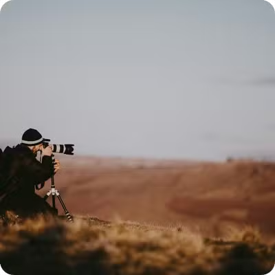
Round the corners of an image with the `br_` parameter. Pass the radius in pixels; set it to at least half the smallest dimension to produce a circle.
`br_` takes a radius in pixels. On a square image, a radius of at least half the side length produces a full circle — for example, a **360×360 px** image needs `br_180` or higher. Previews below cap at **360 px** and show the real output dimensions.
## How does it work?
You add `br_{pixels}` to the transform segment. Autorender masks the corners to the given radius after resizing and cropping, so the rounding applies to the final output dimensions. Larger radii round more aggressively:
* **5**–**20 px**: subtle rounding for photos and hero images
* **20**–**50 px**: card and UI corners
* **50 px** and up, to half the smallest dimension: circular and oval shapes
```text theme={null}
https://assets.autorender.io/LOKVTtKVGb/w_360,br_20/doc1/photographer.jpg
```
 ## How to round corners?
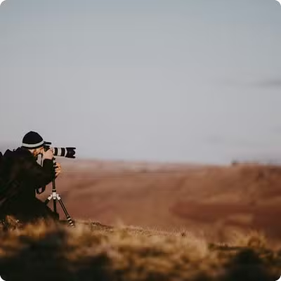
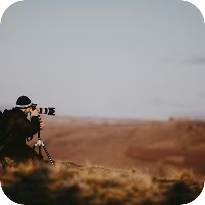
Increase `br_` to round more. The tabs below apply a **10 px**, **20 px**, and **50 px** radius (`br_10`, `br_20`, `br_50`) to the same **360 px** wide image.
```text theme={null}
https://assets.autorender.io/LOKVTtKVGb/w_360,br_10/doc1/photographer.jpg
```
## How to round corners?
Increase `br_` to round more. The tabs below apply a **10 px**, **20 px**, and **50 px** radius (`br_10`, `br_20`, `br_50`) to the same **360 px** wide image.
```text theme={null}
https://assets.autorender.io/LOKVTtKVGb/w_360,br_10/doc1/photographer.jpg
```
 ```text theme={null}
https://assets.autorender.io/LOKVTtKVGb/w_360,br_20/doc1/photographer.jpg
```
```text theme={null}
https://assets.autorender.io/LOKVTtKVGb/w_360,br_50/doc1/photographer.jpg
```
```text theme={null}
https://assets.autorender.io/LOKVTtKVGb/w_360,br_20/doc1/photographer.jpg
```
```text theme={null}
https://assets.autorender.io/LOKVTtKVGb/w_360,br_50/doc1/photographer.jpg
```
 ## How to make a circular image?
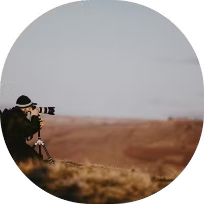
Crop to a square, then set the radius to half the side length. This example crops to **360×360 px** (`w_360,h_360,c_crop`) and applies a **180 px** radius (`br_180`) for a full circle.
```text theme={null}
https://assets.autorender.io/LOKVTtKVGb/w_360,h_360,c_crop,br_180/doc1/photographer.jpg
```
## How to make a circular image?
Crop to a square, then set the radius to half the side length. This example crops to **360×360 px** (`w_360,h_360,c_crop`) and applies a **180 px** radius (`br_180`) for a full circle.
```text theme={null}
https://assets.autorender.io/LOKVTtKVGb/w_360,h_360,c_crop,br_180/doc1/photographer.jpg
```
 For a circular crop, set the radius to at least half the smallest dimension — a **300×300 px** image needs `br_150` or higher to close into a full circle.
## How to combine border radius with other transforms?
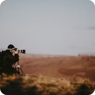
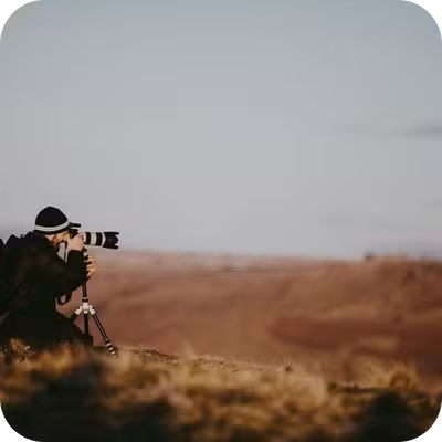
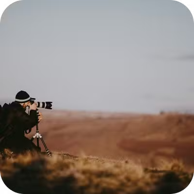
Border radius applies after resize and crop, so it works with any crop mode. The tabs below round a resized image, a cropped square, and a fill-mode crop.
```text theme={null}
https://assets.autorender.io/LOKVTtKVGb/w_360,br_30/doc1/photographer.jpg
```
For a circular crop, set the radius to at least half the smallest dimension — a **300×300 px** image needs `br_150` or higher to close into a full circle.
## How to combine border radius with other transforms?
Border radius applies after resize and crop, so it works with any crop mode. The tabs below round a resized image, a cropped square, and a fill-mode crop.
```text theme={null}
https://assets.autorender.io/LOKVTtKVGb/w_360,br_30/doc1/photographer.jpg
```
 ```text theme={null}
https://assets.autorender.io/LOKVTtKVGb/w_360,h_360,c_crop,br_40/doc1/photographer.jpg
```
```text theme={null}
https://assets.autorender.io/LOKVTtKVGb/w_360,h_360,c_crop,br_40/doc1/photographer.jpg
```
 ```text theme={null}
https://assets.autorender.io/LOKVTtKVGb/w_360,h_360,c_fill,br_50/doc1/photographer.jpg
```
```text theme={null}
https://assets.autorender.io/LOKVTtKVGb/w_360,h_360,c_fill,br_50/doc1/photographer.jpg
```
 ## Recommended values
| Use case | Border radius | Example |
| ------------------------ | ------------------ | --------------------------- |
| Subtle rounding | **5**–**15 px** | `br_10` |
| Card layouts | **15**–**25 px** | `br_20` |
| Rounded UI | **20**–**40 px** | `br_30` |
| Very rounded | **40**–**60 px** | `br_50` |
| Circular (square images) | half the dimension | `br_180` for **360×360 px** |
A radius larger than half the smallest dimension can clip content near the corners, so keep the subject away from the edges when you round heavily.
## Next steps
Crop to a square before rounding into a circular avatar.
Set the output dimensions the corners round against.
Composite rounded images into cards and banners.
Save rounded-corner combinations as reusable `t_` tokens.
## Recommended values
| Use case | Border radius | Example |
| ------------------------ | ------------------ | --------------------------- |
| Subtle rounding | **5**–**15 px** | `br_10` |
| Card layouts | **15**–**25 px** | `br_20` |
| Rounded UI | **20**–**40 px** | `br_30` |
| Very rounded | **40**–**60 px** | `br_50` |
| Circular (square images) | half the dimension | `br_180` for **360×360 px** |
A radius larger than half the smallest dimension can clip content near the corners, so keep the subject away from the edges when you round heavily.
## Next steps
Crop to a square before rounding into a circular avatar.
Set the output dimensions the corners round against.
Composite rounded images into cards and banners.
Save rounded-corner combinations as reusable `t_` tokens.