> ## Documentation Index
> Fetch the complete documentation index at: https://autorender.io/docs/llms.txt
> Use this file to discover all available pages before exploring further.
# Resize and aspect ratio
> Resize images by width, height, or aspect ratio using the w_, h_, and ar_ URL parameters.
Resize any image from the URL with the `w_`, `h_`, and `ar_` parameters. Set one dimension and Autorender scales the other to preserve the aspect ratio; set both to force exact dimensions.
Width and height accept an integer greater than **1**, in pixels. Autorender does not upscale beyond the source resolution by default, so requesting a width larger than the original returns the original size.
## How does it work?
You add resize tokens to the transform segment of the URL. `w_` sets the width, `h_` sets the height, and `ar_` sets the width-to-height ratio.
When you pass only one dimension, Autorender computes the other from the source aspect ratio. When you pass both, the image is resized to those exact dimensions — pair it with a [crop mode](/docs/transformations/crop) such as `c_fill` to control how the content fits.
## How to set width and height?
`w_300` sets the width to **300 px** (`w_300`) and scales the height to match. `h_300` sets the height to **300 px** (`h_300`) and scales the width. Passing both, as `w_300,h_300`, produces an exact **300×300 px** result.
```text theme={null}
https://assets.autorender.io/LOKVTtKVGb/doc1/ar-juice.jpg
```
```text theme={null}
https://assets.autorender.io/LOKVTtKVGb/w_300/doc1/ar-juice.jpg
```
```text theme={null}
https://assets.autorender.io/LOKVTtKVGb/h_300/doc1/ar-juice.jpg
```
```text theme={null}
https://assets.autorender.io/LOKVTtKVGb/w_300,h_300/doc1/ar-juice.jpg
```
## How to set an aspect ratio?
`ar_{width}:{height}` sets the ratio of width to height. Combine it with either `w_` or `h_` — the aspect ratio needs one dimension to size against. If you pass both `w_` and `h_`, the aspect ratio is ignored.
For example, `ar_16:9,w_400` produces a **16:9** image **400 px** wide.
```text theme={null}
https://assets.autorender.io/LOKVTtKVGb/ar_16:9,w_400/doc1/ar-juice.jpg
```
## How to build responsive images?
Request a different width per breakpoint so each device downloads only the pixels it renders. The previews below are capped at **360 px** for side-by-side comparison; in production you would use production widths such as **400 px**, **800 px**, and **1920 px**.
```text theme={null}
https://assets.autorender.io/LOKVTtKVGb/w_240,c_fit/doc1/rotjump.jpg
```
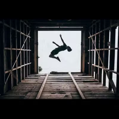 ```text theme={null}
https://assets.autorender.io/LOKVTtKVGb/w_360,c_fit/doc1/rotjump.jpg
```
```text theme={null}
https://assets.autorender.io/LOKVTtKVGb/w_360,c_fit/doc1/rotjump.jpg
```
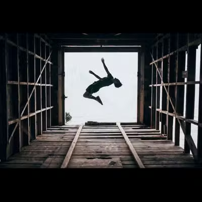 ```text theme={null}
https://assets.autorender.io/LOKVTtKVGb/w_360,c_fit/doc1/rotjump.jpg
```
Point HTML `srcset` at those URLs and the browser picks the right width for the viewport:
```html theme={null}
```text theme={null}
https://assets.autorender.io/LOKVTtKVGb/w_360,c_fit/doc1/rotjump.jpg
```
Point HTML `srcset` at those URLs and the browser picks the right width for the viewport:
```html theme={null}
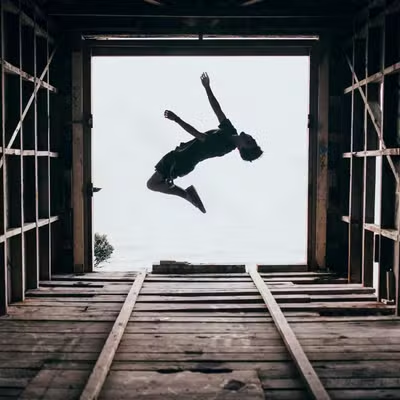 ```
Request widths that match Autorender's width buckets — **320**, **480**, **720**, **1080**, **1440**, and **1920 px** — so responsive variants share cache entries instead of generating a new render for every off-bucket width.
## How to choose sizes?
* Request images at the size you render them, rather than downloading a large file and resizing in CSS.
* Specify a single dimension where you can, and let Autorender compute the other to preserve proportions.
* Combine resize with [automatic format](/docs/optimization/automatic) (`f_auto`) so each browser gets WebP or AVIF for smaller files at the same visual quality.
```text theme={null}
https://assets.autorender.io/LOKVTtKVGb/w_360/doc1/gpose.jpg
```
```
Request widths that match Autorender's width buckets — **320**, **480**, **720**, **1080**, **1440**, and **1920 px** — so responsive variants share cache entries instead of generating a new render for every off-bucket width.
## How to choose sizes?
* Request images at the size you render them, rather than downloading a large file and resizing in CSS.
* Specify a single dimension where you can, and let Autorender compute the other to preserve proportions.
* Combine resize with [automatic format](/docs/optimization/automatic) (`f_auto`) so each browser gets WebP or AVIF for smaller files at the same visual quality.
```text theme={null}
https://assets.autorender.io/LOKVTtKVGb/w_360/doc1/gpose.jpg
```
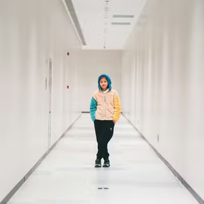 ```text theme={null}
https://assets.autorender.io/LOKVTtKVGb/w_360,h_240,c_fill/doc1/paintbrush.jpg
```
```text theme={null}
https://assets.autorender.io/LOKVTtKVGb/w_360,h_240,c_fill/doc1/paintbrush.jpg
```
 ```text theme={null}
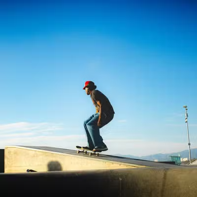
https://assets.autorender.io/LOKVTtKVGb/ar_16:9,w_360,c_fill/doc1/skate.jpg
```
```text theme={null}
https://assets.autorender.io/LOKVTtKVGb/ar_16:9,w_360,c_fill/doc1/skate.jpg
```
 ## Next steps
Control how resized images fit their box with crop modes and positioning.
Serve WebP or AVIF per browser with `f_auto` for smaller files.
Round corners for avatars, cards, and UI elements.
Save size combinations as reusable `t_` tokens.
## Next steps
Control how resized images fit their box with crop modes and positioning.
Serve WebP or AVIF per browser with `f_auto` for smaller files.
Round corners for avatars, cards, and UI elements.
Save size combinations as reusable `t_` tokens.