Documentation Index
Fetch the complete documentation index at: https://autorender.mintlify.app/llms.txt
Use this file to discover all available pages before exploring further.
Overview
AutoRender provides powerful image resizing capabilities that allow you to change image dimensions while maintaining quality and aspect ratios. Use thew_, h_, and ar_ parameters to adapt your media to any layout.
Width - (w)
This parameter specifies the width of the output image. It accepts an integer value greater than 1 representing the width in pixels.If you only specify the
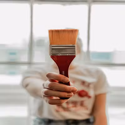
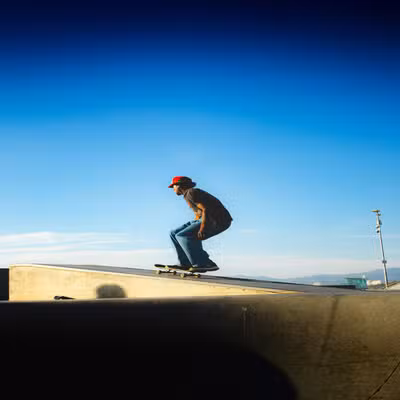
w_ parameter, then while adjusting the width, it will automatically scale the height in order to maintain the aspect ratio.- Original image
- 300px wide


Height - (h)
This parameter specifies the height of the output image. It accepts an integer value greater than 1 representing the height in pixels.If you only specify the
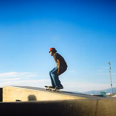
h_ parameter, then while adjusting the height, it will automatically scale the width in order to maintain the aspect ratio.- Original image
- 300px height
- 300 width and 300 height


Aspect ratio - (ar)
Used to specify the aspect ratio of the output image or the ratio of width to height of the output image. This parameter must be used along with either the height(h) or width(w) parameter. The format for specifying this transformation isar_{width}:{height}.
If you specify both height(h) and width(w) in the URL along with the aspect ratio(ar), then the aspect ratio is ignored.
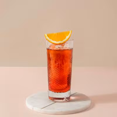
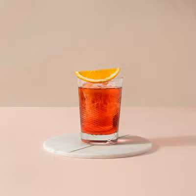
- Original image
- 16:9 ratio
Responsive Images
Create responsive images that adapt to different screen sizes by using different widths for different devices.Mobile, Tablet, Desktop
Preview sizes capped at 360px for easier comparison. In production you would use larger widths (e.g. 400, 800, 1920).- Mobile (240px)
- Tablet (360px)
- Desktop (360px)

HTML srcset Example
Use AutoRender URLs with HTMLsrcset for automatic responsive image selection:
Best Practices
Performance Optimization
- Use bucket sizes: Specify widths that match AutoRender’s width buckets (320, 480, 720, 1080, 1440, 1920) for optimal caching
- Specify one dimension: When possible, specify only width or height to let AutoRender calculate the other automatically
- Use aspect ratios: For responsive images, use aspect ratios to maintain consistent proportions
Quality Considerations
- Avoid upscaling: AutoRender prevents upscaling by default to maintain quality
- Use appropriate sizes: Request images at the size you need rather than resizing in CSS
- Consider format: Combine with format conversion (WebP, AVIF) for better compression
Common Use Cases
- Thumbnail
- Hero (16:9)
Examples
- Width only
- Exact dimensions
- 16:9 aspect ratio