

e_saturation token to the transform segment of any delivery URL:
How does it work?
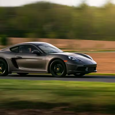
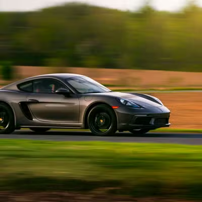
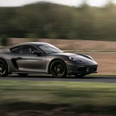
e_saturation:{level} takes a level from −100 to 100. Negative values drain color toward grayscale, positive values intensify it, and 0 leaves the image unchanged. At −100 the image is fully grayscale.
Compare levels:
- Original
- High (+30)
- Low (-50)
When to use it
- Make colorful photos more vivid and eye-catching.
- Pull colors back for a subtle, muted aesthetic.
- Enhance product colors so they read accurately.
- Create vintage or washed-out looks with negative levels.
How do you combine it with other effects?
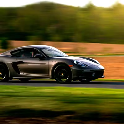
Chain saturation with contrast and brightness in one comma-separated segment. We recommend levels between 20 and 40, because higher levels push skin tones and reds toward looking artificial (e.g.e_saturation:25).
Next steps
Grayscale
Remove color entirely with
e_grayscale.Contrast
Widen or narrow the gap between light and dark areas with
e_contrast.Brightness
Lighten or darken the whole frame with
e_brightness.All effects
Browse every effect token and how they combine.